Case Study: Developing a Logo for Your Brand
Getting started with a logo can be overwhelming but we can help.
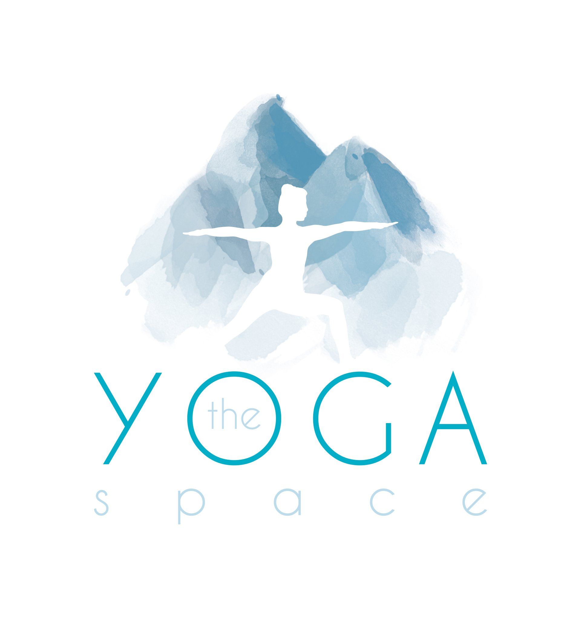
We recently
completed this logo (above) for a client in Chamonix. In this blog post, I’ll give
insight to the process behind achieving this final look, as well as what it’s
like to work with Liontooth for logo development.
Our client came to Liontooth in need of a logo as she is setting up a yoga business in Chamonix, France.
The initial brief was this:
- To create a logo for a new yoga instructor.
- The brand name is The Yoga Space.
- ‘Space’ has multiple interpretations: physical space, their own mental space, their practice space.
- Preferred colours are blues and greens.
- This needs to feel like accessible yoga, not just for advanced ‘yogis’.
- The brand needs to appeal to both men and women.
Before we do anything in terms of design, we always ask for examples of existing logos that the client does and does not like, ideally five of each with a detailed explanation of the reasons for liking or disliking each. This really helps to build an idea of their preferences and helps to steer the initial concept stages of the design process. This streamlines our journey from initial discussions to completed logo.
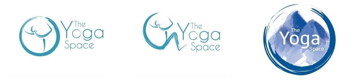
To begin with, we played with the concept of ‘space’ and how this could be represented in the logo. As previously mentioned, this client is based in Chamonix and her environment is very mountainous, so this was an obvious option. Rather than just running with the first idea we had, we explored this further and started to look at relevant shapes that could be used to represent this and we landed upon the idea of the Japanese Zen circle;
“In Zen, ensō ("circular form") is a circle that is hand-drawn in one or two uninhibited brushstrokes to express a moment when the mind is free to let the body create.”
We used this brush stroke to also incorporate a yoga pose, giving a clear and immediate visual indication as to the brand offering, which you can see in the above concepts.
‘Space’ can also be represented by white space, which you can see in some of these concepts, where the silhouette has been created leaving the yoga pose as the clear space.
We played around with having just the circle, just the mountains and then as the process moved on, we experimented with combining the two.
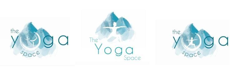
In terms of the brand name, we needed YOGA to be the most prominent word; again, giving clear and immediate indication of the brand’s offering and intention. You can see from the concepts that we tried a range of layouts and positions for the wording, always trying to maintain a sense of balance and the focus on YOGA.
At this point, the focus was on the overall concept of the logo; colours and fonts could be adapted further down the line. By offering these multiple shapes, styles and fonts in the initial concepts, it meant these could be used to help direct the design process and narrow down what our client wanted. So, from here it became a case of pick and mix, and tweaking. Logo A, with the yoga pose from B and the font from C.
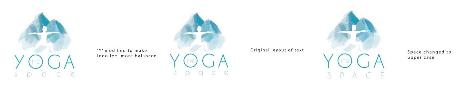
Often, as the process goes on, a client will get a clearer idea of what they do and don’t want for their own logo, what they do and don’t like. Through this process, our client requested we try spacing out the word ‘Yoga’. In order to make this work with the layout, some adaptations needed to be made to the font. As a result, the ‘Y’ has been amended so that the ‘leg’ of it sits to the left, rather than straight down (as you can see in the above image). Without this adaptation, it looks like ‘space’ is misaligned. As an experienced graphic designer, it wasn’t necessary to change the font entirely, just to make this minor amend to make sure everything sat correctly and centrally.
The beauty of a logo like this is that the various elements can be split out and used independently for various purposes such as social media visuals, branding physical spaces or merchandise. With this particular logo, there are a lot of options making this a very versatile and user-friendly logo design.
If you would like help with designing a logo, please feel free to contact me. It doesn’t matter if you have all the ideas or no idea, I can help.
And go check out The Yoga Space on Instagram!